Page Control Parameters:
Page Control Roles:
Display Issues with Mobile Devices
Our website is optimised for desktop displays. If you are using a mobile device, the display might look a little odd - with items offset to the right of the screen, and other items not displaying properly This is particularly severe with older mobile phones using small, low resolution screens.
If you find this is affecting your enjoyment of the site, there are several options available to improve the experience.
1. Display the page in Landscape instead of portrait
Rotating your device will usually switch the display to Landscape mode. The additional width to the screen should fix any display issues. You might find that the automatic rotation has been disabled. If that is the case, you can normally enable it in the Settings Display Options Menu
2. Show Desktop Site
If using a mobile device, your browser (Chrome, Safari, Edge etc) has an option to switch between treating this as a mobile or as a desktop site. If treated as a desktop site, it will display correctly; scaled to fit the screen. You might need to zoom in to make the text a comfortable size.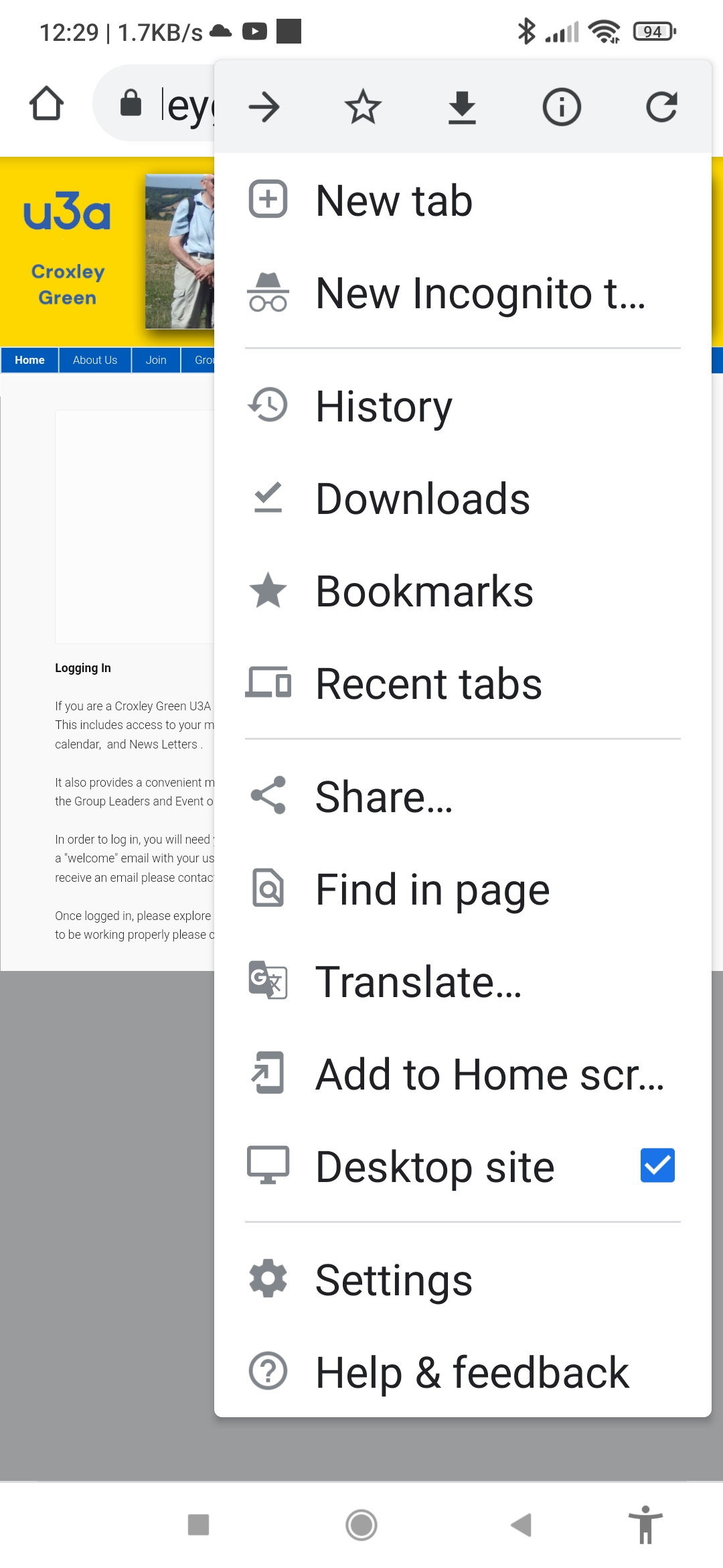
On Chrome, the control to force it to display as a Desktop Site can be found under the 3 vertical dots in the top right of the menu bar. Tick the box as indicated
 Return to Top ▲